Don't forget to click on the picture to enlarge it!

Tuesday, December 14, 2010

Artist of the Month Dec. 2010

I won Artist of the month!  This man's name is Art Shegonee.  He's a wonderful Native American Dancer that does many great things for society. http://www.callforpeace.org/programs/talkingsticktalkingcircle.html
Winning tonight was a great boost to my mood.  I found out the commission piece I did of "Katie and Alex" on my last blog post was delivered to the wrong address.  The neighbor put it on my clients porch and we think it blew away!
The Boardwalk Bragfest Featured Boardwalker

Wednesday, December 8, 2010

Katie and Alex 2010

Katie & Alex

Finally a real posting!  This is a commission I did for a very good friend of mine.  She's giving it as a Christmas gift.  As a matter of fact she commissioned this same piece last year for a Christmas gift to another person.  This made it very interesting and yet again another learning experience.  I usually write down all the colors I used. Even pencil lead softness. Guess what I didn't do the first time?  Luckily I had a digital pic on file and could match things up.  Next, I usually keep the initial drawing I do that is used to transfer on to the watercolor paper. (you don't sketch on the watercolor paper. make your mistakes on the initial drawing)  Guess what I didn't keep? Next make sure I don't change anything up too much, no artistic license.  I figure if she liked the first one enough to reorder don't change a thing.  All in all I think they are the same. As a matter of fact I think this one is a little better since I had practice on the first. Now off to mail it.  

Tuesday, November 23, 2010

Sunflower

Well I happened to get another commission piece so I haven't been around.  It's commissioned for a Christmas present so I've been working hard trying to get it done.  I thought I'd leave you with this.  It's a photo I took then ran it through Corel Painter Essential 4 Auto Paint Chalk.  At some point I will draw this one.

Friday, October 29, 2010

Adaptive Art Show

Bellevue East First Annual Adaptive Art Show!
She was so excited to show off her work.

Wednesday, October 20, 2010

more to come


http://kathyjurek.blogspot.com/2010/10/month-of-pumpkins-day-19-get-free-print.html

You won't see me for a little while because I will be working on a commission project but thought I'd guide you to another artist with a great give away (see above link and pic).  She's been doing a pumpkin a day for the month of October.  She's my fovorite watercolorist. go check out her pumpkins.

Monday, October 18, 2010

grey feather

Building layers

This layer actually has Pumpkin orange in it.


Refining Values

Now we get into the Dk. Green, Black Cherry and Indigo Blue


Burnished

This was a quick study.  I think it only took me about 5 or 6 hours. Does it look like a grey feather?
The main colors used were Black Grape, Indigo Blue,  Goldenrod, Dioxazine Purple, Pumpkin Orange, Dr. Green, and Black Cherry. The highlights had some Greyed Lavender, Slate Grey, Sky Blue Light and White. The linear strokes in this made it go faster than the very small circle strokes to build  color. All in all I'm pleased.

Thursday, October 14, 2010

Feather

Establish Values

I know I said I was going to go off on my own and get away from these studies but I looked at the rest of them and there is a lot to keep learning.  I'm still going off on a project of my own but not ready to post anything yet.

Deepen Values

This is a study from "Masterful Colors" on how to get greys with out using grey pencils.


Define Edges

This is different from the other studies because you build color using linear strokes instead of small circular strokes.


Thursday, October 7, 2010

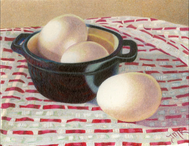
Eggs in a bowl

Pushing Values.

Getting some more reds in the tablecloth has helped.


Adding Highlights and Darks

I'm getting happy about the bowl.  But this is the step everything starts to go downhill.  putting blush pink in the shadow of the tablecloth has to be a typo cuz it looks like crap! The eggs lost their farm fresh look .

Saturate and burnish.

The bowl is still coming along nicely. I've lost too many of my whites in the weave but I've fixed what I could of the blush pink in the shadow.


Sunday, September 26, 2010

Eggs in a bowl

Creating underpainting.

 I think I got a little lost in the checkered tablecloth.


Enhancing darks.

I think one of my eggs isn't oval.  Must see if I can address that. Still trying to figure out how the checks in the tablecloth are going to work.


Adding Color.

Did I tell you I hated checkered tablecloths?


Deepening the Colors.

Maybe I fixed my lopsided egg?

http://arlenesteinberg.com/MasterfulColorPage.htm


Monday, September 13, 2010

Best of Show


"Denim and Daisies" won Best of Show at the Bellevue Artists Assoc. Silver Palette Show!
My daughter, the model, with the drawing and ribbon.
"Belle" won Second place in the animal category!

Photobucket

Friday, September 10, 2010

Iris


Adding more color.


Making it pop.  Okay that was the caption in the book for this.  Mine is getting lost in the weeds.  The flowers parts are labeled in this demo but I got lost.  I got to where I couldn't tell a "Standard" from the "Style Crest" from the "Fall"!


Saturated with color.


Finally done! I couldn't wait to get this one done.  I got sloppy with keeping the page clean.  It even folded when I put it in the scanner at one point! (Luckily these are for my reference latter) I was a little happier when I burnished in this step that blended things better and after getting a coat of workable fix on it I could add some white highlights. I decided I like the blue iris after all opposed to the purple my eyes wanted it.

Tuesday, August 31, 2010

Iris


So to elevate my grooves from the graphite I did this contour in color pencils that correspond to the underpainting. If you are interested in this technique...
http://www.amazon.com/Masterful-Color-Vibrant-Colored-Paintings/dp/1581809573


Underpainting in Black Grape and Black Cherry.


Adding some color.


Turning the Iris Blue.  This step was hard for me because I think of Iris's as Purple but the finished blues will look great.

Monday, August 30, 2010

Red Barn


Okay this isn't really art but I did paint Saturday! This is me on scaffold my dad set up so I could paint "safely" This is the "Barn" on dad's property. My brothers, Sister-in-law, Dad and Step mother had a day of bonding and painting.

Thursday, August 26, 2010

Yellow Pear w/ Grapes


Darkening the color again.


Defining the fruit, shadow and highlights.


Saturating the paper with color.


Burnished and done!  Well I didn't like this as much as the tomato. I learned many things not to do which is as much of the point with these exercises as how to do the techniques. Mostly I want to learn more about color which I just love here.  You can still see the grooves the graphite made I just couldn't fill in. I know how to fix that so stay tuned for that in the next exercise.

Tuesday, August 24, 2010

Yellow Pear w/ Grapes


It's an omen! The exercise started off bad. I wasn't able to find all the colors listed for this project.  They are lightfast prismacolors and I guess I can only find them online.  SOOO I'm improvising.


Getting some shadow depth here. This is the second drawing I did of this pic.  The first I used a hard lead pencil and it put grooves in the paper Then the colored pencil doesn't want to fill in the small grooves.


Even though I redrew and used a VERY light hand I still got the grooves!  Not sure if it's the paper change from the tomato pic. That was done on W/C paper this on bristol vellum or the hard lead.  I decided not to redo but to learn something and see if I can fill it in. (Enlarge and you can see it)

Another thing I learned was the directions said to use a Verithin white pencil to burnish the reflections on the grapes.  Well I don't like this method at all! You get close with the color and it gets in the white and creates a bad effect. See you when I get the next four steps done.

Friday, August 20, 2010

Tomato


Step 5  This step has Pumpkin Orange and Raspberry.


Step 6  I like the look of the transparency of the color here.  I'd probably have stopped at this point.


Step 7  This step fills in every bit of white paper.  You loose the transparency here.   Slate grey was layered over the table shadow. I immediately regretted this even though it's in the directions.


Finished!  I can't take credit for it but I think it turned out awesome.  In person it looks like an acrylic sticker on the paper. I didn't pay attention to the form of my tomato in the beginning because I was more interested in learning the color. Got to remember to do that next time.  I'm not sure how I'm going to be able to transfer these techniques into my own work yet. 23 colors were used in total! I think I need more practice. Time to turn the page and see my next exercise.

Wednesday, August 18, 2010

Tomato

I got a new book "Masterful Color" vibrant colored pencil paintings layer by layer by Arlene Steinberg.
As a how to book I really like it so I'm doing some of the exercises in it.  The first is this tomato.  No it's not a green tomato. In the end it will be red.  The idea is using complementary colors for the shadow areas. This has several greens. Dar, Green, Celadon Green, and Jade Green.  In the steam there is Inigo Blue and Black Cherry and the shadow has Dioxazine Purple Hue with Greyed lavender.


Now I've layered Black Cherry all over the Greens and table shadow. Also some Yellow Ochre in the shadow.


Now It's supposed to start turning red. Tuscan Red is layered on the Black cherry and Black Cherry and Slate Grey in the shadow. Plus a little Olive Green in the steam.

Getting some highlights in with Jasmine and more Yellow Ochre in the shadow. Now a little more red with Raspberry over the Tuscan Red. Stay tuned for the next 4 steps! (Don't forget to double click the pic to see enlarged)

Search This Blog

Followers

Blog Archive

About Me

My photo
I teach art through many venues. Currently I teach with Metro Community College Continuing Education. Also I belong to the art galleries Eppley Gallery at the Eppley Airport in Omaha Nebraska and "Fine Arts on Fifth" in Malvern IA